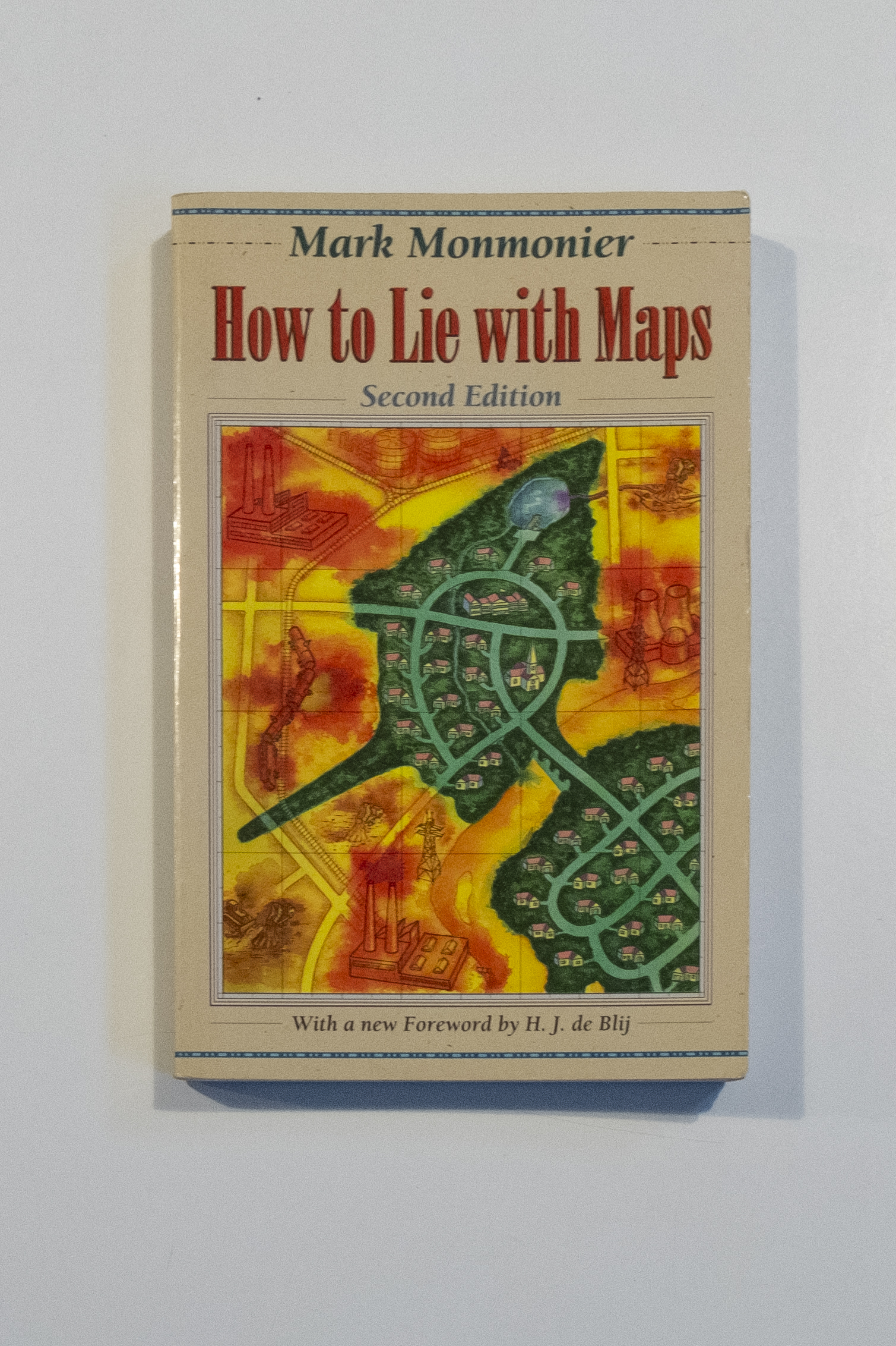


The Center for Land Use Interpretation in Culver City is slowly being taken over by its expansive library, slowly (and literally) pushing the wall separating the exhibition and office spaces toward Venice Boulevard. If understood purely as the space allocated to use, the library and its resources is significantly more important than any one exhibition, but the more likely reading is that the vast amount of research resources is necessary to distill down into comprehensive detailed exhibitions. After several days spent browsing the collection (the only way to engage it, as there is no catalog), I settled on the second edition of Mark Monmonier’s How to Lie with Maps. Not long after my final visit and acquiring a copy of the book from the UCLA library to read from home at a more leisurely pace, Los Angeles entered the first round of “Safer at Home” orders in March 2020 and the importance of accurate, complete choropleth maps suddenly became a daily consideration.
Originally published in 1991, updated with a second edition in 1996 and third in 2018, How to Lie with Maps examines the decisions made in reducing the world to a map. Blatantly or invisibly, conscious and unconscious decisions on the part of the cartographer embed and advance their position as the truth. Derry becomes Londonderry becomes Londonderry/Derry. The Indo-Pakistani border leaps across Kashmir as we compare maps. More subtly, division and classification of data radically changes the implications of US voting behavior. Obviously false scrawls try to alter the weather in order to avoid admitting an error.
Without reproducing the entire book here, the sampling of methods introduced to lie in maps covers the gamut from innocuous to clearly manipulative. Maps choose a projection method, select, simplify, smooth, and displace features to improve legibility. And then they use those same techniques to promote their desired narrative. Choropleth maps aggregate data into a handful of categories to show us televisions per household in segments of a map. Both data breakpoints and map sectioning are ripe for manipulation. Ambiguous tonal scales reduce legibility and make quick recognition of trends difficult. Failure to adjust statistics for population generates radically different maps when comparing geographic regions with disparate density.
Monmonier’s text treats virtually all of the tools to alter meaning as ambiguous in their intent. Without appropriate context, it’s difficult to distinguish well-meaning blunders from intentional obfuscation. When we distill the various strategies for lying with maps down to their most concentrated form, we end up with asymmetry of information and implied authority. The map maker has access to more complete data than the reader and the simple act of publishing a map makes a claim that it is the best representation of reality.
Every time we use a map, we decide how much we trust the author – both to tell us the truth and to avoid errors. The stakes determine how close our examination must be, and in many cases there may be no stakes at all. Most of the time, a wrong turn is unmemorable, and so we learn to blindly trust. The real world sometimes must remind us that the map is not the territory. Sometimes, the question is vastly more complicated.
At several points in the second edition, Monomonier looks disparagingly on the (then) emerging field of consumer computer mapping tools. He largely views them not as a democratization of knowledge, but rather a potential danger. In his opinion, the promise of professional-appearing maps reflecting specific interests is not sufficient to outweigh the risk of misinformation.
The parallel to the early potential of social media (skipping past the decentralization and lower cost of entry from the early internet – we all know how that played out) are hard to miss. The ability for anyone to publish to a wide audience is both a promise and the threat. The risk is not unique to maps, rather it is a reminder that at this time there is virtually nothing that we can accept at face value.
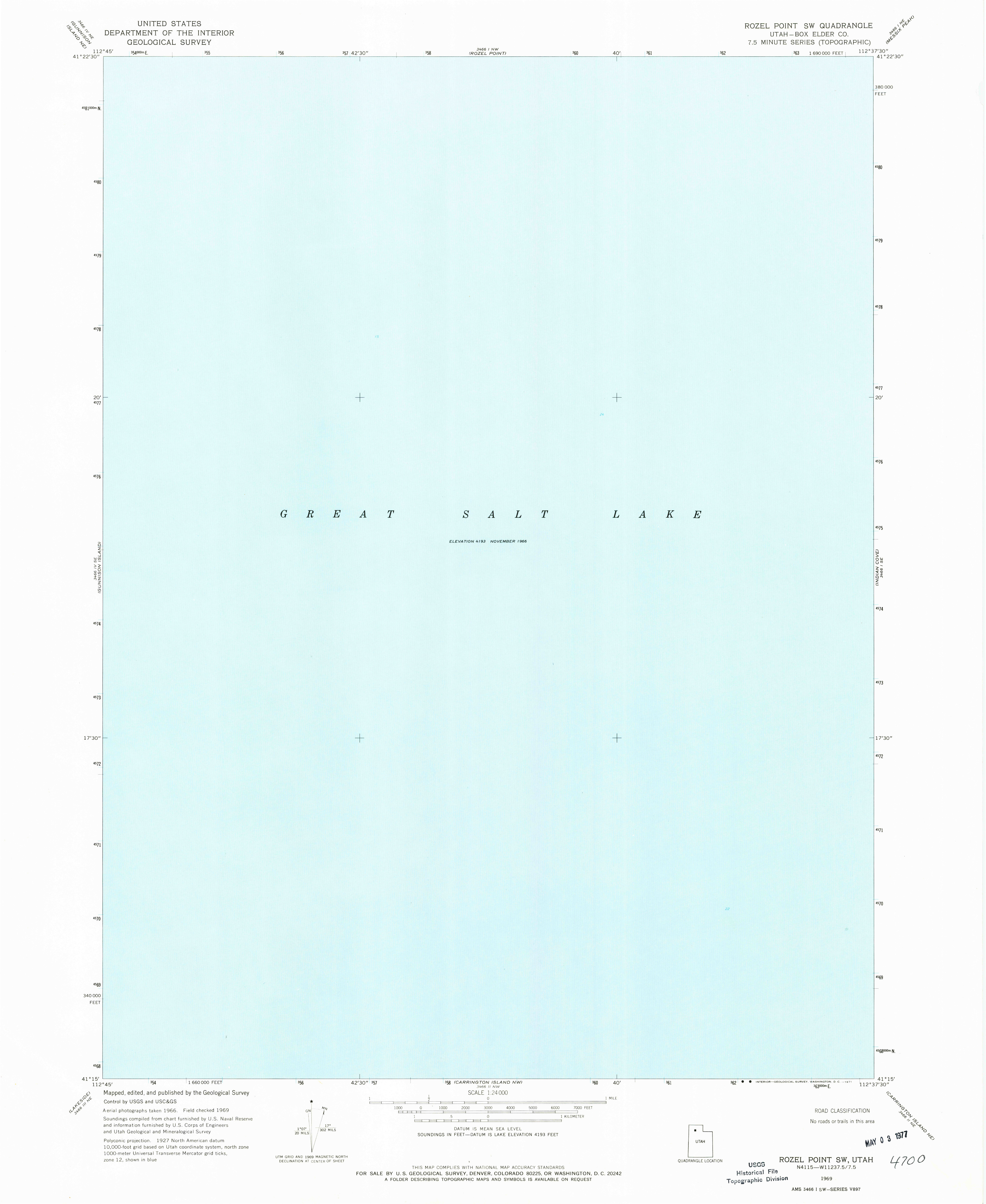
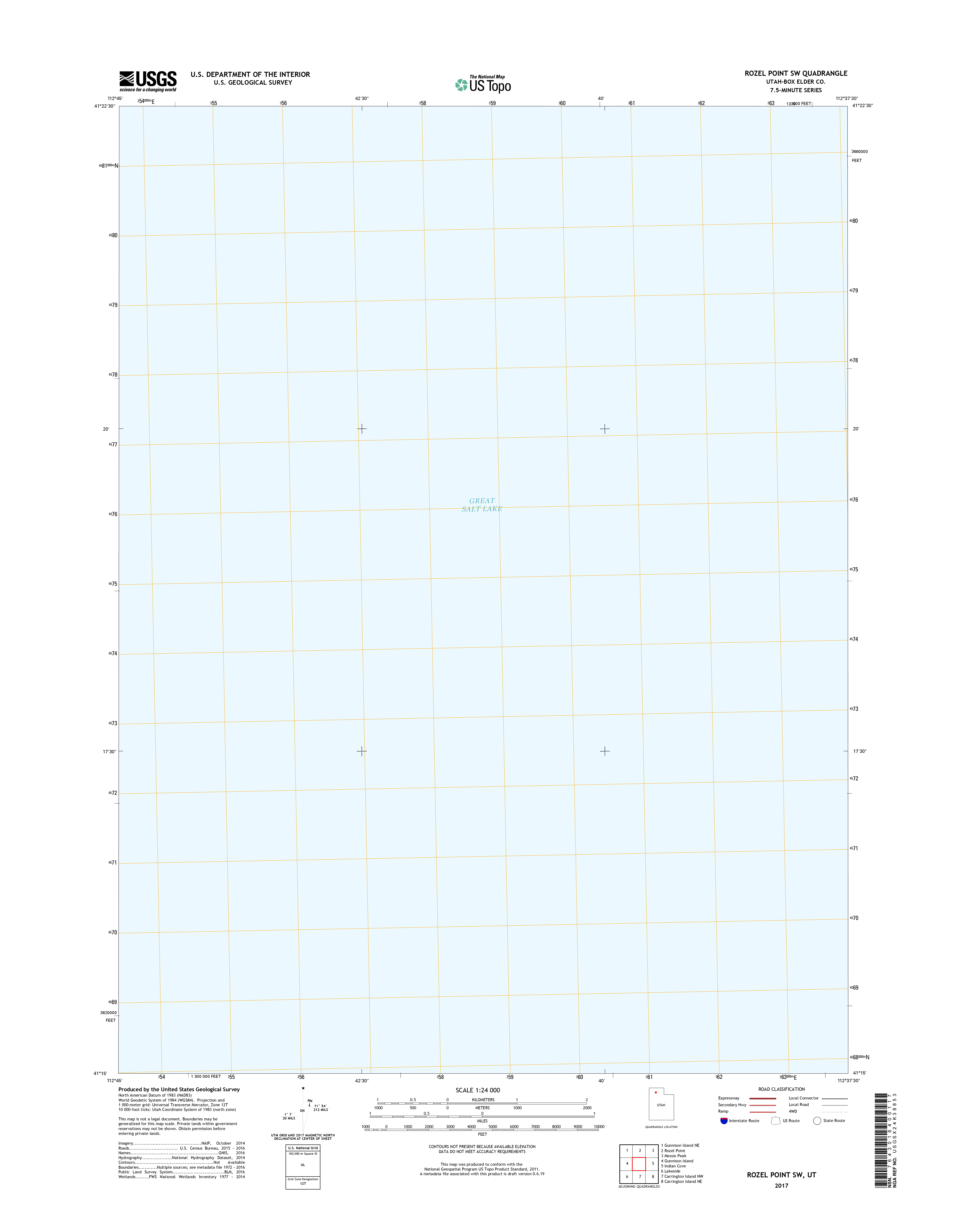
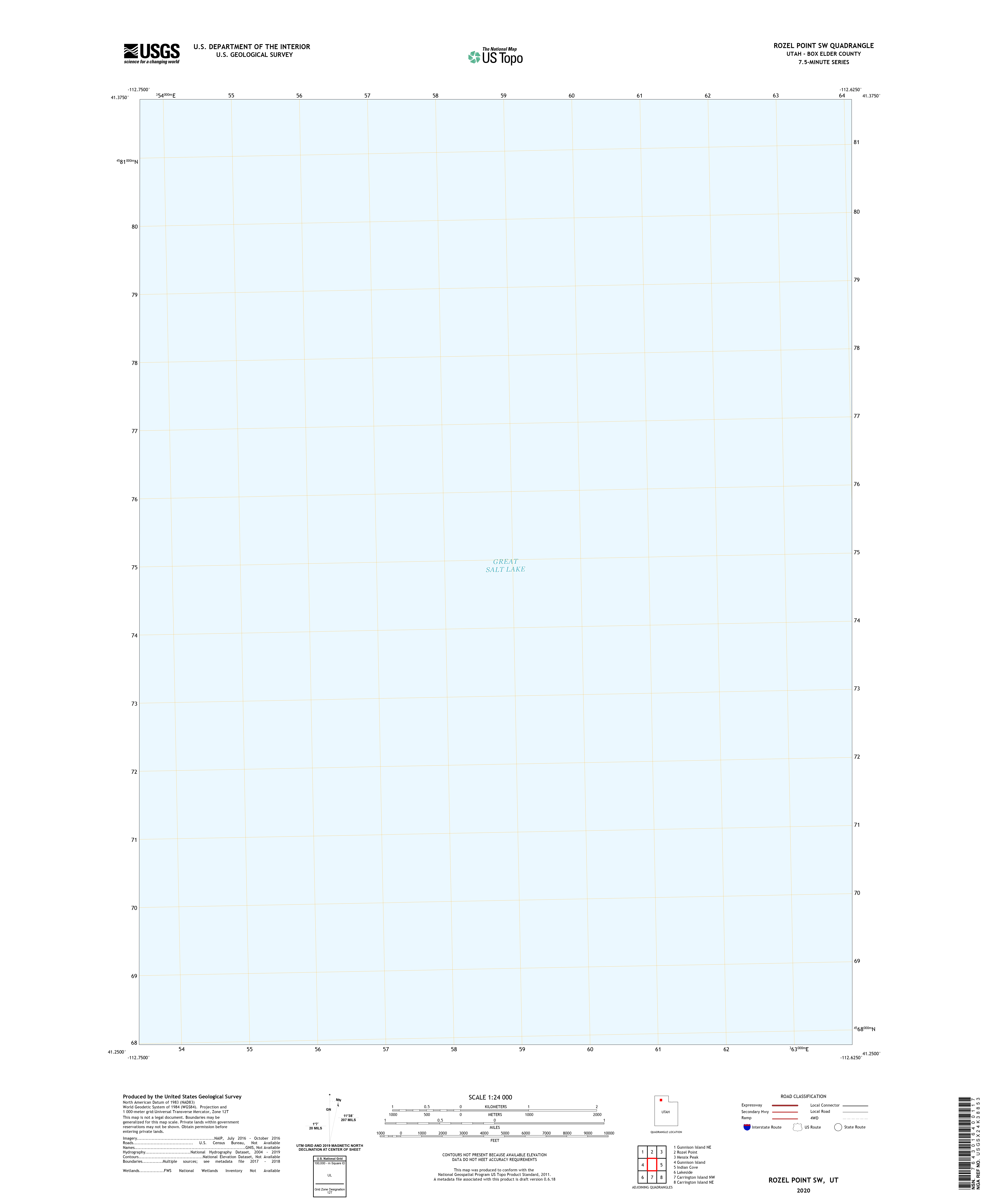
Monomonier does bring out one possibility for an inarguably true map, at least once we accept the constraints of the data it intends to represent. The USGS 1:24,000 Rozel Point SW map is beautiful in its simplicity and accuracy. It depicts a section of the Great Salt Lake coincidentally adjacent to the location of Smithson’s Spiral Jetty, and as such is a “featureless light-blue rectangle adorned only by a note at the center ELEVATION 4200”. Sadly, later revisions of the map have destroyed its minimalist beauty, with the 2017 version labeled “GREAT SALT LAKE” and bearing a pale yellow grid, and the 2020 revision incorporates what appears to be satellite imaging of wave patterns on a multitonal grey field. In the most blank of maps, the incorporation of new consumer technology adds nothing to our understanding.
Trusting maps with only one feature may be a strategy to reduce our cognitive workload of verifying the truth, but in practice is overly restrictive. Monomonier’s epilogue largely concerns itself with the risk of maps made with dual motives, and promotes “healthy skepticism” while appreciating their “power to explore and explain geographic facts.” He seems to view understanding how we may be lied to as the primary strategy to defend against such attacks.
At this moment, however, it doesn’t feel like enough to simply be able to explain how a map is wrong. Engaging with the mapmaker’s ever present silent biases to make sure we represent reality as it is should be a minimum standard. The inherent politicization of what appears, what is left out, and how we summarize data demands that we invert the strategies Monomonier warns against to create maps that generate the more just and equitable world we need.